The world has changed quite a bit in the past couple of years.
Big societal changes often mean big changes in design as well. You may be wondering if your product label should change with the times. Or you may be launching a new product and want to make sure it looks fresh and current.
What product label design trends should your business be aware of in 2022?
Behind the Trends
The last time we checked in on current product label design trends was in June 2020. Not long before that, worldwide lockdowns in response to the COVID pandemic threw the e-commerce revolution into high gear.
Brands who’d been brick-and-mortar stalwarts—like food and beverages—found themselves having to reassess their product label: Would it have the same appeal when viewed as an ecommerce thumbnail? Would any of the information on it have to change to meet regulations (like if selling overseas, for instance)?
Related Reading: Guide to Custom Product Labels for E-Commerce Business
Another influence? A desire for simpler times. Nostalgia and the quest for comfort and distraction feature heavily in the latest label looks. Other product label design trends reflect the aesthetic preferences of a younger generation of consumers that is rapidly outpacing their elders in influence.
Keep in mind, however, that trends can be fleeting. Who knows how the world will change over the next two years? The most memorable product label designs stand the test of time.
Designer’s Perspective:
“There’s always a risk with following trends too closely because it may not be something that really lasts. It may make your product look really dated too quickly.”
– Gary Carbon, Creative Director, Carbon3Sixty
Label Design Trend No. 1: Playing With Typography
Refreshing your product label design often requires establishing a delicate balance between appealing to new customers and preserving your brand identity for existing customers.
Brands in 2022 are walking that tightrope by experimenting with their typography, while leaving other design elements untouched.
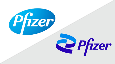
For example, after becoming a household name in 2021, pharmaceutical company Pfizer chose a new digital-friendly typeface to feature alongside a DNA-inspired logo—but, the iconic blue color scheme remains. Of the new look, the company’s designers say, “It's a clean, open typeface for a global future and a perfect philosophical and aesthetic match for the new Pfizer.”
Trending fonts for 2022 range from attention-grabbing thick strokes to balloon-like rounded fonts to authentic handwriting.
But while choosing a new font can be fun, don’t forget about function: If you sell your products online, most of your potential customers will be viewing your products through tiny mobile screens where real estate is cramped and fine details get lost. Large, clean fonts and concise messaging speak more loudly online.
Designer’s Perspective:
“Your product has to be readable and has to compete with other similar products. So, you can experiment a little bit with type, but you can't go so far afield that what you’re doing hurts you rather than helps you.”
– Gary Carbon, Creative Director, Carbon3Sixty
Label Design Trend No. 2: Fun and Comforting Colors
The modern world is exhausting, to say the least. Some brands are giving their customers a break from the mental overload by choosing soothing, muted color palettes. Pillowy pastels, rustic earth tones, and wispy watercolors abound in 2022 label design, offering respite from an overwhelming world.
On the opposite end of the spectrum, bright and bold “candy colors” are also in vogue. Cheerful shades of cherry red and watermelon green stand out online, evoking memories of childhood fun.
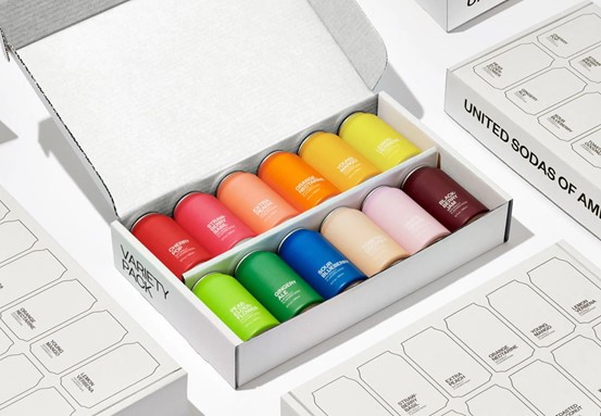
United Sodas of America has won packaging design awards for the brand’s use of both color trends. The eye-catching swatch-like labels can’t be missed, with just enough muting (and a sophisticated matte finish) to take the edge off.
Designer’s Perspective:
“The web has really shifted to favoring brighter colors. So now, print is shifting to bright candy colors, as well. If it works for your brand, candy colors are nice because they will stand out. The brightness pops off the shelf."
– Gary Carbon
Label Design Trend No. 3: Metallic Accents
In an effort to attract influencers and look amazing in unboxing videos, many brands are going upscale with their packaging design, integrating metallic accents for a luxe, premium appearance.
There are many ways to add metallic elements to a product label. Options include metal foils, metallic ink, and even actual metal pieces (such as metal plates or wires).
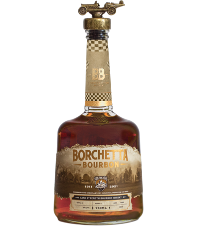
Metallic label design is especially prevalent in the spirits industry, where craft distilleries use gold, copper and silver flair (burnished or shiny) to connote timeless tradition and craft. Take, for example, this bottle of Borchetta Bourbon, which topped the 2021 Craft Spirits Packaging Awards in the whiskey category:
Designer’s Perspective:
“If you use gold, especially metallic gold, against black, that creates a nice elegance with a lot of shelf appeal.”
– Gary Carbon
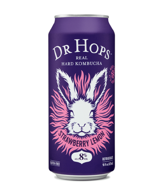
Label Design Trend No. 4: Psychedelia-Inspired Label Design
Psychedelia is both nostalgic and in the moment. Psychedelic design first resurfaced in the fashion world in 2021, either “echoing our own sense of confusion and chaos” or “expressing a release from reality and a surge of hedonistic energy as we anticipate the joys of a still-hypothetical end to the pandemic.”
The hallmarks of psychedelia—wavy text, mind-bending imagery, swirls of color—are now showing up on product labels.
Cannabis and CBD brands are, unsurprisingly, leading the way (although many brands in that industry are opting to shake their counterculture reputation with natural and health-focused imagery). However, other product categories are also getting in on the far-out fun, as evident from this groovy can of hard kombucha by Dr. Hops:
Designer’s Perspective:
“Once you’ve established your brand, you really have to make sure your label design choices align with your image. Do you really want to do a psychedelic label if you're doing a pasta sauce? Maybe, if that's your brand and your whole brand is about being a throwback, a hippy thing. But if you're not that, psychedelia doesn't make any sense.”
– Gary Carbon
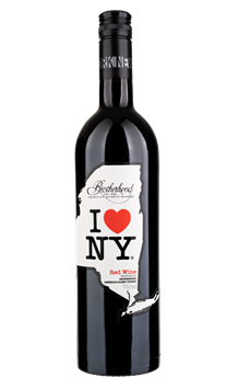
Label Design Trend No. 5: Die-Cut Label Shapes
Brands need every edge they can get in the intense competition for attention on store shelves and online shopping sites.
One way to differentiate your brand from the pack is with an unconventional label shape, which can be achieved with custom die-cutting.
Skilled label printers can die-cut complicated label shapes with intricate precision. For example, the label on this bottle of I♥NY Wine from Brotherhood Winery captures the coastlines and borders of its namesake state:
Designer’s Perspective:
“When people come in, and they talk about their brand not working, a lot of times they want to throw everything out and start again. And I think the best thing to do is just take an inventory and say, ‘What are the assets we have? What can we modify? How can we update them to be more interesting—such as by changing the label shape?’”
– Gary Carbon
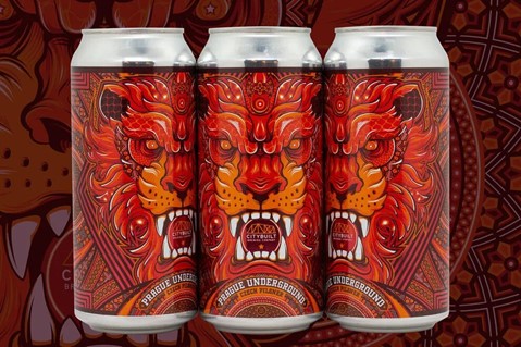
Label Design Trend No. 6: Maximalism
Minimalism—the “less is more” aesthetic—is an approach that has dominated product label design for years, and for good reason: Minimalist design conveys essential information quickly, helping brands connect with busy shoppers.
But there is still a place for maximalism in product label design. Some brands in 2022 are leaping from the minimalist bandwagon, standing out in a sea of “blanding” by cramming every square inch of their labels with ornate imagery, complex patterns, rainbows of color, varying textures and layering.
As usual, craft beer makers are pioneers when it comes to breathtaking maximalist design. CityBuilt Brewing’s award-winning Prague Underground label offers just one example:
Take Inspiration from the Trends, Don’t Let Them Define Your Brand
The latest product label design trends offer food for thought when redesigning or updating your product label. But expert Gary Carbon cautions against just copying these product label design ideas without considering your audience or whether the trends have staying power.
If you’re looking to incorporate a trendy design element into your product label, Carbon advises starting small, saying, “When you start with something you haven't done before, you have to kind of take steps with it and let it evolve a little bit and then refine.”
Finally, your product label has critical roles to play beyond matching the mood of the moment. Learn how to design your product label for form and function in our free Guide to Product Label Design.