They say you can’t judge a book by its cover. Wise words, but most of us ignore them when choosing products off the shelves of stores and supermarkets. In our defense, when you don’t have much else to go on and only a few seconds to decide, how else would you judge a product other than by its packaging?
While timelessness has strong appeal, some brands run the risk of simply going stodgy, putting no thought into their “good enough” packaging over the years (or decades).
Packaging design trends may have changed since your product first hit the shelves. Is it time for a refresh?
Here are some of the most recent trends in packaging design to use as inspiration:
1. Opulence, Extravagance, Maximalism
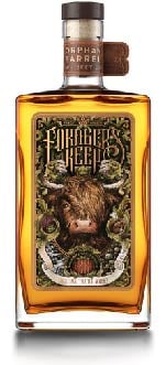
Minimalist package design has been going strong for years, and it will probably remain popular for many years to come. But some brands are turning the trend on its head and taking a 180-degree turn towards maximalism. This extravagant style is defined by intense colors, fine details, dense imagery, and florid text.
Maximalist design evokes a luxurious feeling many consumers may be craving amidst the economic downturn of 2020.
This bottle of Forager’s Keep Scotch Whiskey, from the Orphan Barrel Whiskey Co., is a perfect example of maximalist package design. Every square inch of the label is crammed with botanical imagery, metallic lettering, and elegant scrollwork.
2. Flat Design
For many years, the prevailing design trend was three-dimensional. Flat surfaces (such as product labels) were given the appearance of depth and texture through shading and lighting effects. But in the past few years, designers of everything from smartphone user interfaces to advertising have embraced the possibilities of two dimensions.
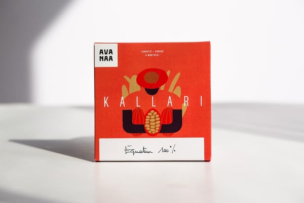
Flat design uses minimalist style, high-contrast coloring, and symbolic rather than realistic imagery for an appealing, lightweight feel that is as easy on the eyes as it is on the brain. Flat design is especially resonant with younger, digital-native audiences who are at home in the two-dimensional worlds of websites, apps, and video games.
A number of big-name brands have gone flat over the past decade. The design of this Avanaa chocolate bar packaging proves that flat doesn’t mean boring.
3. Retro-futurism
Can you be nostalgic for the future? Sure! Our perception of the future has more to do with the present than any real ability to guess what comes next. Retro-futurist design is rooted in past attempts to represent what the future would look like.
For example, in the 1980s, we all thought the future would be swathed in neon. In the 1960s, the future was all about flying cars and robot maids. Sadly, none of these trends have come to pass, (the closest we have to robot maids is the Roomba) but what has come to pass is an approach to package design that has consumers looking backward and forwards at the same time.
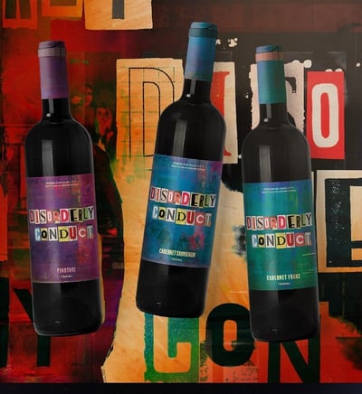
The design for this Disorderly Conduct wine label reflects the punky, apocalyptic spirit of 1980s sci-fi films like Robocop and Escape From New York.
4. Flexible Packaging
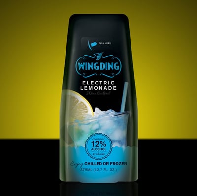
This trend has more to do with the function of packaging than the appearance (although, with the right design choices, flexible packaging can look great). Technological improvements have made it possible to do away with rigid materials for some consumer products and replace them with flexible options such as stand-up pouches and bags. Modern flexible packaging uses high-tech plastics such as polyethylene or polypropylene, which can be printed on directly for an efficient production process.
The advantages of flexible packaging include a longer shelf life for perishable items, the convenience of being able to close and reseal the packaging, less weight than rigid materials (perfect for e-commerce), and standout shelf appeal.
The award-winning design for this Wing Ding cocktail pouch includes a pull tab that can be removed to insert a straw – portability and fun.
5. Sustainable Design
Sustainability is, perhaps, the hottest design trend of the current era, and it will only continue growing. Product packaging is a major contributor to the waste that is piling up in landfills around the world and clogging up our oceans.
Consumers – surprisingly, of every generation – want to keep buying the brands they love, but while limiting their impact on the environment at the same time. Brands are becoming increasingly conscious of their ecological impact, and many are setting goals to reduce their energy use and to prioritize sustainable materials.
Eco-friendly packaging design can mean many things, but what it comes down to is rethinking the entire life cycle of product packaging with the environment in mind. Sustainable design choices can include:
- Choosing renewable materials, such as FSC-certified paper.
- Using eco-friendly water- and vegetable oil-based inks.
- Printing recycling and reusability instructions front and center.
- Partnering with an environmentally responsible label printer.
- Installing efficient lighting in areas used to manufacture packaging and labels.
Learn more about sustainability and label design in our free whitepaper, “Environmental Considerations of Label Printing: State of the Market, Considerations at Play.”

