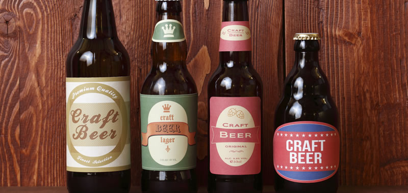
There is a lot of great beer out there, thanks to the revival in craft brewing. Brewers are getting increasingly creative, with their delectable-sounding IPAs, porters, lagers, sours, and stouts tempting us into trying something new every time.
A big part of that temptation? The label. We’re not going to say that what goes on the outside of the beer bottle is just as important as what’s on the inside, but it’s easy to see that some of the most innovative craft brewers have been adding a not-so-secret ingredient to their barley and hops: eye-catching label design.
Shelf appeal is no small matter when it comes to beer. As the venerable research firm Nielsen reported, 71 percent of craft beer buyers “say they like to try brands with bold and interesting packaging.”
Beyond the surface appeal, there’s also some psychology at play. For example, one Oxford University researcher found that products packaged with the color red tend to taste sweeter. (This may be why Coca-Cola almost had a revolt on its hands when it released a special-edition white can one holiday season.) People want the label to accurately reflect the contents, which is why a heavy, chocolate porter with a pale, flowery-script label would probably be more baffling than enticing.
For more stats that show how labels influence consumer behavior, check out our recent infographic.
Of course, even the most attractive label can harm your brand if it doesn’t stand up to expected use conditions.
So, how can you design a beer label that will attract first-time buyers, contribute to an enjoyable drinking experience, and make your fans proud to share a bottle with their friends? It comes down to two main areas:
- How the label looks and feels.
- How the label performs.
The Look and Feel of a Great Craft Beer Label
Your beer label is your chance to tell the story of your brew, flaunt your brand identity, or just look good. How you choose to do that depends mostly on your brand’s sense of aesthetics and your customers. There are at least as many different approaches to beer label design as there are varieties of hops.
Some craft breweries go for a classic look, some revel in non-conformity, and others pursue simplicity. When design legend Milton Glaser critiqued beer labels for the New York Times (which is worth reading for his insightful commentary), he noted the craft beer label designer is often trying to “create the illusion of not knowing what you’re doing when you actually do.” In other words, the goal is authenticity—a departure from the slick, mass-produced aesthetic.
Whatever look you have in mind for your craft beer label, a good label printer will offer a host of modern techniques to help make it stand out.
- Metallic effects can give your label a touch of class or rustic charm, depending on the material you choose.
- Die cutting can give your label a shape that breaks with the same-old rectangular tradition.
- Bold inks can help your labels pop on the shelves.
- Interactive elements, such as QR codes, can extend your labels into the digital realm.
- Textural features, such as embossing and stamping, can add a premium feel to your label.
How a Great Craft Beer Label Performs
Yes, there is such a thing as performance when it comes to beer bottle labels.
Consider, for example, the case of Noon Whistle Brewing. The Chicago-area craft brewer specializes in barrel-aged beers, which buyers often store for a year or two in their cellars before opening. Noon Whistle switched label printers after buyers complained their labels were wearing off during the aging process.
Opening a prized beer “should feel like an important moment,” Noon Whistle founder and brewmaster Paul Kreiner told us.
Whether your customers age them in carefully controlled cellars or shove them into sloshy coolers, beer bottles are often roundly abused, with the label suffering the brunt of it. Beer drinkers want a label that can withstand whatever they throw at it.
Here are a few environmental factors that can cause a craft beer label to crack, rip, peel, smudge, or lose its color:
- Exposure to light can cause the colors in ink to fade.
- High heat can loosen the bonds of certain adhesives.
- Moisture can also cause adhesives to fail, ink to run, and make certain label materials susceptible to ripping.
- Rough handling can make a label crinkle and crack.
All of the above label disasters can be avoided by choosing the right label materials, inks, and adhesives for the application surface and the environment to which the bottle will be exposed. An expert, experienced label printer can be an invaluable guide, helping you choose label elements that have been proven to hold up while looking great.
What You Need to Know to Design the Next Great Craft Beer Label
As we’ve seen, the secret ingredient in a great craft beer label is a label printer that knows the difference between different adhesives and face stocks as well as you know your ales from your lagers. How can you find such a printer? Learn how to identify an expert label supplier in your free Custom Label Buying Guide.