We often talk about the technology-driven methods brands use to put their marks on their products and engage with consumers. But as we look to the future, we shouldn’t forget the past. Some of the most innovative label designs of the past have lessons to teach us about branding and endurance.
Among the millions of labels that have graced innumerable commercial products over the past century and a half, several stand out. These are the labels that redefined product categories, showed us new ways to market, or simply stood the test of time as iconic representations of legendary brands.
Here are some of our favorite product labels from the past, many of which are still in use today.
1886: Levi Strauss Gets Tough
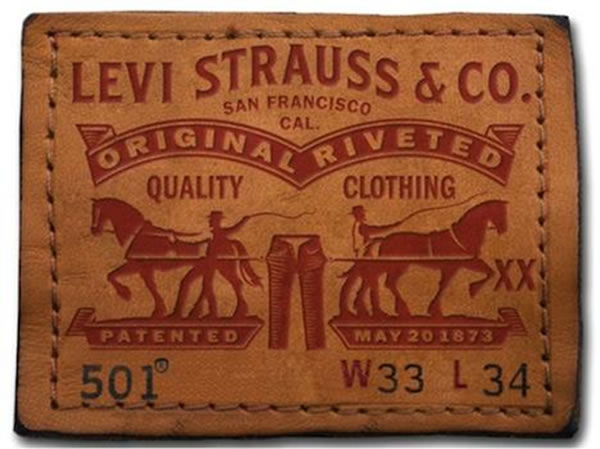
Levi’s is one of the most — if not the most — “American” of American brands. If you own, have owned, or have even seen a pair of their blue jeans, you could probably sketch a version of their classic “two-horse” label from memory.
The label has gone through some changes since it debuted in 1886. Originally printed on a leather patch, Levi’s now uses (vegan-friendly) synthetic material. But the message remains the same: the jeans are virtually indestructible.
The label lesson: If the label lasts, so will the branding.
1898: Campbell's Soup Finds Its True Colors
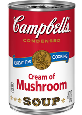
In 1962, Andy Warhol expressed a truth that should have been evident long before; there can be artistry in making labels.
Would Campbell’s be America’s top soup brand (indeed, its most reputable company) if it had stuck with its original colors of orange and blue? Who knows? But we do know that when the company treasurer suggested a switch to white and red in 1898, he landed on a combination that would resonate with American families well over a century later.
The label lesson: The right colors make an impact.
1921: Simplicity Works for Chanel No. 5
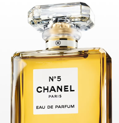
Coco Chanel herself designed the minimalist bottle and label for her house’s best-selling fragrance, which has been referred to as “modernism in a bottle.” The simple white label includes the name of the fragrance, the brand, and nothing else in a bold sans serif font. The approach is no-frills, yet somehow, it defined femininity for generations of women worldwide.
The label lesson: When it comes to classic, timeless design, less is often more.
1948: Coca-Cola Makes Red Its Own
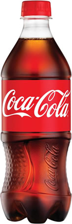
From the shape of its classic glass bottles to the timeless Spencerian script of its logo, Coca-Cola boasts some of the most recognizable branding in the world. Add to that the striking hue of red encircling the bottles and cans of the company’s flagship product. Some call the red (which can’t be found among the Pantone colors) Coke’s “second secret formula.”
As part of its recent “One Brand” marketing push, Coca-Cola is relying on the red color to serve as a unifying mark across its entire family of products. When you see red, you think Coke.
The label lesson: Being consistent builds recognition.
1963: Chiquita Labels Fruit
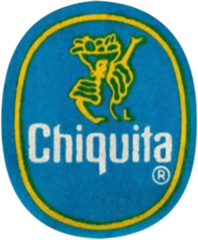
After experimenting with paper wrappers for a few years, Chiquita came up with a method of affixing labels to bananas in 1963. All of a sudden, fruit, which for years had been a generic staple, became a branded item. And Chiquita became the most identifiable fruit brand of all.
Over the decades, Chiquita has used its label in countless marketing campaigns, as a sort of collectible. Its latest “Scan With Shazam” version is interactive, triggering an augmented reality (AR) experience.
The label lesson: A label can transform any product into a brand.
1978: No Name Makes Generic Cool
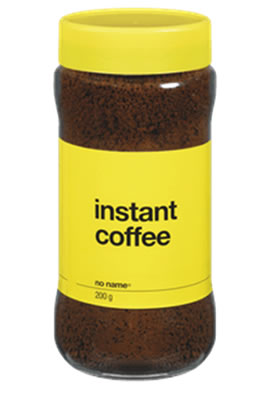
Americans may not be familiar with the No Name brand, but to Canadians, it’s a beloved part of their grocery-buying experience. Launched in 1978, by the Loblaw Company, No Name was intended as a basic discount brand. But the utilitarian black-on-yellow labels quickly became a cultural phenomenon.
Today, Canadians honor (or should we say “honour”) their favorite generic brand with fondness and humor.
The label lesson: A label doesn’t need to be flashy to stand out.
1979: Absolut Clears Up Its Image
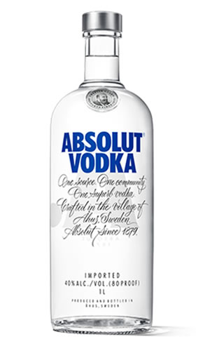
When your brand name is Absolut, what more do you need to say? When Absolut vodka was introduced to the global market in 1979, its Swedish makers wanted to emphasize the purity of the spirit. They chose a design that mimicked an 18th-century medicine bottle and a label that wouldn’t obscure the crystalline contents behind it.
In fact, the Absolut label is barely a label at all. It’s screen printed directly on the bottle. The unique design helped Absolut gain an edge over its more staid competitors and grow to become one of the best-selling brands of alcohol spirits in the world.
The label lesson: Let your label enhance, not obscure, your product.
1991: Intel Labels Other Brands’ Products

Even though most people never buy microprocessors (they buy the devices that contain them), one manufacturer has managed to become a household name — all thanks to labels.
In 1991, Intel, which sold its products almost exclusively to other businesses, hit on the idea of marketing to the consumers who bought the computers powered by its chips. The company paid computer makers to stick “Intel Inside” labels on their machines, and the brand soon became known as a mark of high-end processing power.
The “Intel Inside” campaign is still studied today as one of the earliest and most successful “ingredient branding” efforts. Quick, name another microchip maker!
The label lesson: Even “invisible” products can build their brand with the right label.
2007: Coors Cools Off
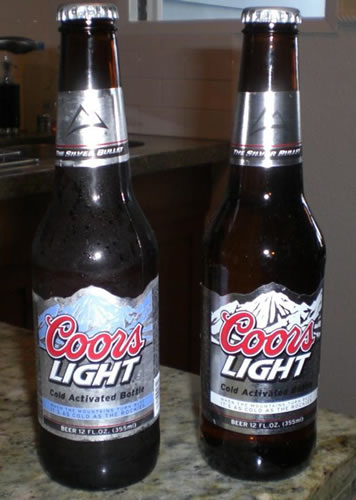
Product labels can share nutrition information, features, and brand stories with consumers, but Coors Light took it a dynamic step further when it introduced its Cold Activated labels in 2007. Using a special thermochromic ink, the labels tell beer buyers when their brews have hit optimal drinking temperature.
“Is it a gimmick or a great idea? Well, I’m already starting to wish all beer had this nifty ink on the labels,” wrote one beer blogger.
The label lesson: Find your audience’s problems and see if your label can solve them.
2009: Heinz Ketchup Updates Its Look
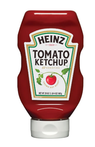
For 110 years, Heinz Ketchup, the dominant ketchup producer in the U.S., featured a pickle on its label — despite the fact that its ketchup recipe includes no pickles. In 2009, the company decided it was time to make a change that focused on the product’s wholesome ingredients. Out went the pickle and in came a tomato ripening on the vine.
Don’t worry though, the emblematic shape of the label still remains.
The label lesson: Thoughtful, considered change is good.
What Makes a Memorable Label?
It’s almost impossible to predict which product labels will stay with us and which will fade away. But certain elements — bold colors and shapes, quality materials, and creative designs — seem to possess a perennial appeal.
How will your brand’s next label stand out? Contact us today to discuss ideas, and we’ll make them come to life!