You have beautifully designed label graphics ready to go, and you’ve chosen your label supplier. Now it’s time for your printer’s prepress team to make sure every color, font, and image on your label looks exactly the way you want.
The professionals in the prepress department are masters at transferring graphics onto ink and label material, reproducing your vision at the highest level of fidelity. But a few additional things can help the process go as smoothly as possible.
We spoke with Joe Kane and Maryann Hupp, two of the prepress wizards at The Label Printers, and asked them to share their expertise about artwork and label printing.
What's the top thing that makes the art process go smoothly?
Maryann: One thing that is really helpful is when customers send us a “native file.”
Joe: The ideal formats are either Adobe Illustrator or Adobe Photoshop. We like to get the PDF as well, so we can see exactly how the final product should look – but the PDF should be in addition to the native file, not a replacement for it.
Maryann: The process really goes smoothly when the printer is sent a production artwork with everything that goes with it: all the fonts, all the links, all the images. It also helps to include a version with live text in case you need to make edits in the future. This can save customers a lot of time and money, because the project won’t need to be re-done from scratch if there’s a text change.
Tell us about color. What are some of the processes you work with to capture a color accurately?
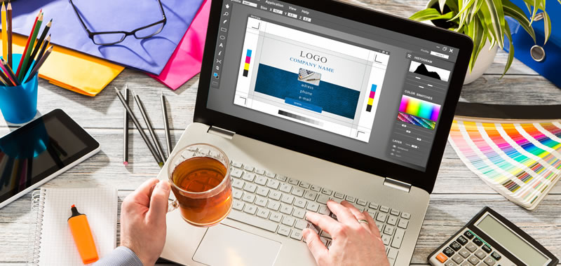
Joe: Images are typically printed in four colors, CMYK [cyan, magenta, yellow, black]. It’s important to understand that the pictures you see online are in RGB [red, green, blue], which is how the colors are presented in electronic displays. Plus, they’re backlit from your monitor. It’s a click of a button for us to translate RGB to CMYK, but it comes at a cost to your colors. The conversion won’t be exact. Whenever you can, it’s best to provide us CMYK from the get-go.
Maryann: Logos, on the other hand, often require that we use spot colors. Spot colors are very specific single colors that can be defined with a PMS [Pantone Matching System] number. For example, if you have red in your logo, it’s a corporate color, like PMS 185 RED. It’s part of your brand. You’re going to want that specific red.
Joe: Very often, a customer will give us a PMS number along with a CMYK version that they accept, so we can print it on the digital press. That goes a really long way towards shortening the process. The artwork may say 285 blue [in PMS] but they’ve already given me the ok to use these CMYK numbers in the digital printing process.
What image quality or dimensions? What would you like people to know?
Joe: That resolution and quality are two different things. You can use a High-resolution stock image that is over 300 dpi and great quality. But I’ve seen people take a 72 dpi image off the internet and ‘upscale’ it to 300 dpi to meet a printers requirement. This will look much worse than the original image.
Keep in mind that size matters as well. Your image may be at 300 dpi, but if it’s one inch by one inch and your label is five by five, you’ll lose that resolution when we blow it up.
In general, the fewer transformations an image file goes through before it gets to us the better.
Logos, on the other hand, are usually done as vector art. That makes the image resolution independent; the image can be printed large or small without causing any degradation to the quality.
Any other tips or insights you’d like to pass along?
Maryann: If you want wall-to-wall colors, you actually have to go past the edge of your label. It’s called “bleed,” and if you’re designing a label, you should include bleed. Your artwork should extend an eighth of an inch larger than the label size all the way around, so a sixteenth of an inch in each direction.
Joe: Any artwork, however, should be kept a sixteenth of an inch or more away from the die lines of the label. That’s because of the movement on press it’s impossible to keep everything centered for each and every label.
Maryann: That includes inset borders, as well.
Joe: Of course, there are exceptions to this rule, and we can work with those. But the sixteenth of an inch is a good rule of thumb.
And speaking of sizes and clearance, if you have a barcode on your label, you should pay attention to the “quiet zone.” This is the white area around the barcode. To recognize the code, scanners need this area to be clear. Typically, it should be a tenth of an inch on each side. Some codes require up to a quarter of an inch.
Clearly, you and your team know a lot about printing and image formats. How can your customers best take advantage of your expertise?
Joe: It’s great when we can have conversations with customers and develop a clear understanding of their expectations. Regardless of the quality of the assets you provide and the file formats, you have a vision for the look of your label, and we want to help you bridge the gap between your assets and your vision.
Maryann: We also want to say that all the tips we shared today are for ensuring the process of submitting your artwork to a label printer will go as smoothly as possible. But if you don’t know a bitmap from a vector, don’t worry. We want your label to look as good as you do, and we’ll help you along every step of the way.
Want to know more about how labels are made and what goes into getting the best label possible. Read our Custom Label Buying Guide Today.